
The key to conversions actually is deceptively simple – be useable and useful. Most optimizers fail to realize this, or they allow mind-numbing tactics to distract them.
Today, we’d like to talk about why usability and usefulness are so crucial, and what it takes to apply this knowledge to build a landing page that turns skeptics into customers.
Why Usability and Usefulness are Central to Conversion Rate Optimization
It doesn’t take a genius to figure out that consumers need to be able to use your site before they can convert, make a purchase, or do anything meaningful on the site. Unfortunately, usability obstacles still are surprisingly common, and they may do even more harm than you realize.
It’s amazing just how much a small inconvenience can change a user’s behavior. Take StubHub. Their sales pages used to contain a link that said “see details.” Even though the link was located right next to the price, users didn’t realize that the link took them directly to the ticket purchase page. Instead, they thought it was a link to a fine print page.
After replacing the link with a simple “Go” button, StubHub’s revenue increased by millions of dollars.
Meanwhile, according to a study conducted by Google, 67 percent of users will be more likely to buy from a site if it is mobile-friendly. If that kind of data doesn’t motivate you, consider the fact that 50 percent of users said they would be less likely to use a site if it wasn’t mobile-friendly, even if they liked the brand.
By the same token, a loading time delay of just one extra second can cut your conversions by 7 percent, and most users will abandon your site if it takes more than 6 to 10 seconds for it to load. Nearly half expect it to load within 2 seconds, and waiting an additional second will reduce customer satisfaction by 16 percent.
Users also expect a page to be not only highly usable, but useful. Research has shown, for example, that poor product information is responsible for about 8 percent of usability problems. Worse, about 10 percent of cases of outright user failure (where the user just gives up and abandons the site) are explained by poor product information.
Targeted landing pages are a huge part of this. It’s easier to be useful when you know what kind of user you’re targeting, allowing you to direct them to the exact information they need to see in order to convert. Research from HubSpot reveals that if a brand has between 31 and 40 landing pages, it will generate 7 times more leads than a site with just 1 to 5 landing pages. A site with over 40 landing pages will produce 12 times more leads than one with 5 or less.
Other tests have shown that adding a “Chat Now” button can increase sign-up forms by 31 percent and that if you segment your users to provide them with the most valuable information, you can boost conversions by a whopping 400 percent.
If your landing page isn’t useful enough to share or direct users to the product information they’re looking for, a good portion of them are just going to give up and take their business elsewhere.
When it comes to landing page conversions, I hope I’ve convinced you that usability and usefulness come first. Now let’s talk about how to make that work.
It Starts with Brand
We’re going to be spending a lot of time talking about testing, data, and principles of design, so I think it’s very important to emphasize this particular point before we move forward: every decision needs to be brand-driven.
Many in conversion rate optimization (CRO) say “test everything.” I think that deserves a caveat. It’s usually better to say “test everything that’s consistent with your brand.” Granted, there will be times when you discover that your brand is failing you and that it needs to be rebuilt. Testing, of course, will be an enormous part of that undertaking. But, generally speaking, branding should drive what you test, not the other way around.
I don’t want to contribute to any misconceptions here. Your choice of branding should be, at least in part, data-driven. It should be built for the marketplace. It should be designed to differentiate itself, to stand out, and to offer a unique selling proposition that makes you a unique choice.
I say unique, rather than better, because it allows you to define more concrete goals. It allows you to define a mission statement and a set of principles that make you different in a meaningful way from your competitors. Aiming for “better” doesn’t allow you to do that, and it ultimately leads to the kind of “soulless” CRO that produces generic landing pages.
Without a brand concept, you can succeed at CRO and fail as a business. Short-term conversion rates don’t guarantee long-term profitability.
Once you’ve defined your brand’s values and its mission statement, you can design landing pages with purpose. While every landing page has the implicit purpose of converting visitors, landing pages that have some identity and an implicit brand-driven purpose will tend to be better at this, and they will contribute to a lasting impression that can affect long-term customer retention, word-of-mouth, and demand inelasticity.
The problem with testing literally everything is that people evaluate brands like they do human beings. Scientific research has even revealed that we transfer celebrity personalities over to the brand personalities they are associated with. Brands endorsed by Jessica Simpson become sexy and fun, but also ditzy and weak.
Brands without personality are inherently difficult to trust. If we can’t assign a consistent personality to a brand, or that personality seems volatile and unpredictable, it becomes untrustworthy.
Yes, some research has shown that tension between conflicting personality traits actually can make brands more interesting, just like The Doors’ Jim Morrison was made more interesting by the fact that, simultaneously, he was a sensitive poet and a reckless troublemaker. But this kind of tension still needs to be part of a coherent brand identity. Jim Morrison was consistently a troublemaker and a sensitive poet.
This kind of intriguing tension doesn’t come through in a landing page design that looks like the result of several random statistical tests. We need look no further than the disaster of New Coke (which ironically may have strengthened the old brand) to realize that short-term testing doesn’t tell us anything useful about long-term branding.
For more on branding personality, I’d recommend what The Financial Brand has to say on the subject.
As much as everything that follows is important to landing page design, keep in mind that it all revolves around a consistent brand personality.
Above the Fold? Not So Much
Once upon a time, CROs and web design experts expressed how important it was to keep everything above the fold. This has changed quite dramatically.
Yes, Jacob Nielson’s research has shown that users, on average, dedicate 80 percent of their time to the information above the fold and only 20 percent of their time to everything that follows. But that research can be very misleading, as a previous KISSmetrics post has pointed out.
Sure, startups like Square may put their call to action and everything else above the fold, but that doesn’t mean it’s the only way to do things. Consider Shopify’s POS system, a similar product. Yes, their landing page features a colorful image and a call to action above the fold, but it also extends downward, provides additional information, and offers a second call to action at the bottom of the page.
I couldn’t tell you which of these pages is converting best or which might benefit from looking more like the other, but I can tell you that there are plenty of examples of landing pages that converted better when they extended far below the fold.
Take this case study of Crazy Egg’s landing page. Here’s a side-by-side look at the landing pages:
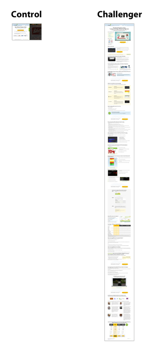
The long page doesn’t, by any means, keep everything above the fold. The long landing page was 20 times the length of the control, yet it converted 30 percent better than the short page.
I want to stress that this isn’t just because the landing page is long. It’s because the longer page is more useful to visitors. They identified 4 key objections that were preventing users from converting, and they explored those in detail.
At the same time, it’s important to keep things interesting. The last thing you want is for a user to click away out of boredom. Take a look at this long form sales page that was discussed at ConversionXL. Notice how it keeps changing visual styles in order to keep things novel?
There are a few reasons why there’s nothing inherently wrong with long-form sales pages and why sometimes they are the better choice:
- As we stated earlier, when users abandon a site, 10 percent of the time it’s because they couldn’t find the information they were looking for. If a user needs to be convinced to make a purchase, too much information can’t hurt, as long as it’s organized in a useable fashion, and the information being provided is useful for the person in question.
- If the stakes are high, long form content is almost always going to convert better. It may not be necessary if you’re asking for $1.50 or if everything a user needs to know about a product can be conveyed easily in a simple image, but it’s a different story if you’re asking the user to spend a significant amount of money, because they need to understand exactly why your product is perfect for them.
- White space is important. The more cluttered a page, the harder it is to get the user to focus on the message that matters. While the most important message should indeed be above the fold, it’s best if what is shown there is only one message. When you need design to be simple and uncluttered and you need the message to address a large number of objections, the only answer is to design a long page. Cramming as much as possible above the fold typically hurts conversions and produces an unprofessional looking page.
Again, the highest converting landing page is going to be the one that is most useful to your visitors. Instead of thinking about length, focus on building a page that:
- Addresses all of their possible objections, focusing on the strongest objections first. You can use a survey tool like Qualaroo to find out what those objections might be.
- Use images to convey messages when possible, especially if those images contain people. 37 Signals found that conversions for Highrise went up by 102.5 percent just by including a large image of a happy person on the front page.
- Testimonials and social proof can sometimes put off users. In the same Highrise case study, 37 Signals discovered that expanding their landing page to include testimonials and social proof actually cut their conversions by 22.72 percent. Arguably, this information is less useful to visitors and can come across as bragging.
- Your landing page can be as long as necessary, but everything on the page should serve a purpose for users. I don’t believe in attention spans. People will sit quietly through a 2-hour movie if it entertains them. The key is to understand your audience and provide them with information that they care about. The goal is to avoid wasting their time, which is not always the same as using less of their time.
- Text should be highly readable.
- Videos are more useful to visual learners, but most people won’t watch the video. You can be more useful to more people if you include a video, and as the example at ConversionXL points out, this can boost conversions by as much as 46 percent.
The Oatmeal sums up most people’s frustrations with landing pages pretty succinctly:
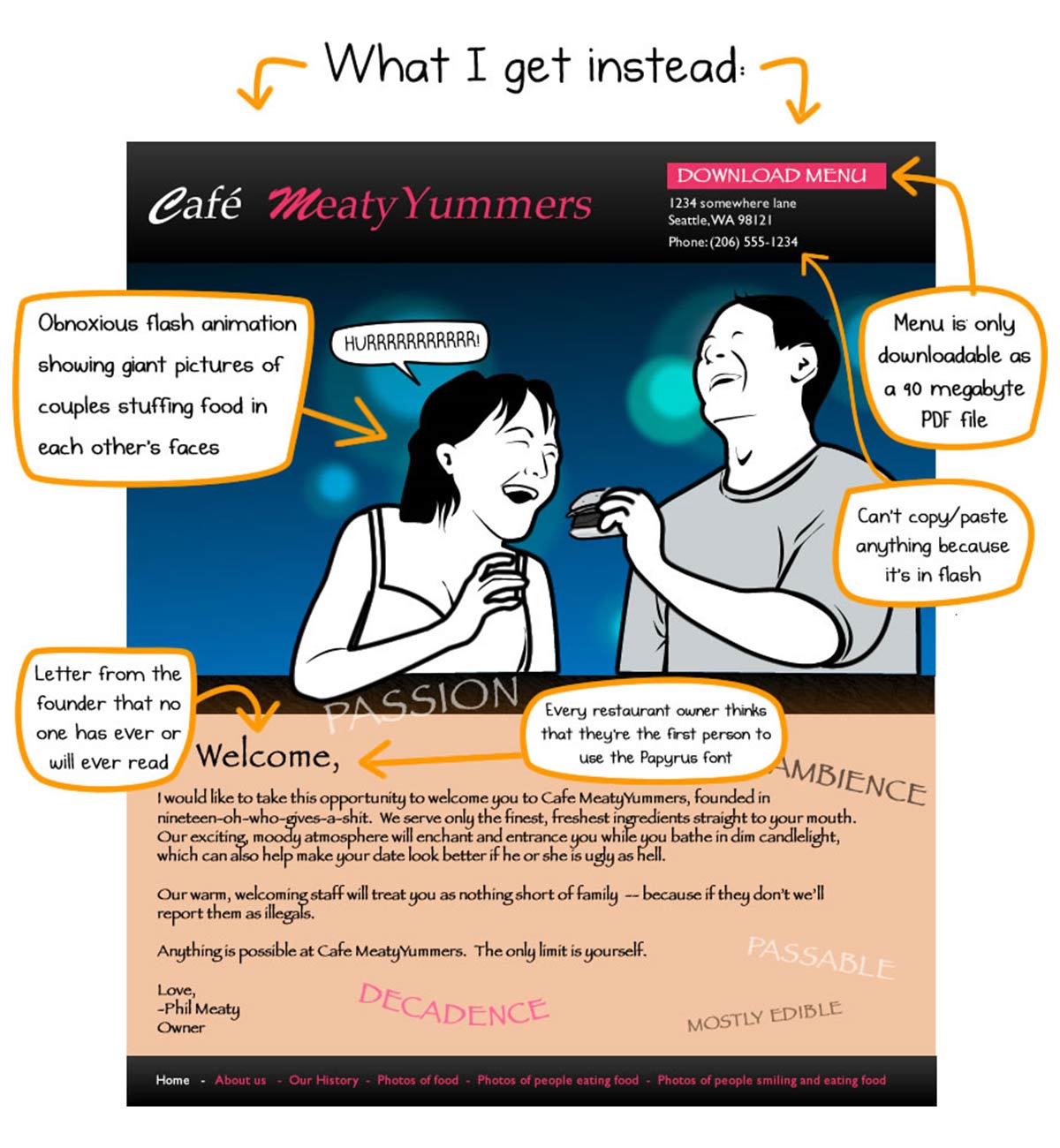
Do your users a favor and give them the information they’re looking for.
Principles of Design
To elaborate on exactly what we mean by useable, I’d like to sum up Joshua Porter’s 19 principles of design:
- Clarity comes first, and it’s the most important job of any interface.
- The purpose of an interface is to enable interaction; interfaces can be artistic, but they are not art.
- Never pull your user’s attention in more than one direction at a time.
- The user is always in control of the interface.
- The more direct the interaction, the better.
- Only one primary action on the screen at any given time.
- Give secondary actions less visibility with weaker colors and secondary screen real estate.
- There’s always one more natural step, even after the user converts or makes a purchase.
- Interface elements should look like what they’re supposed to do.
- Elements that do the same thing should look the same. Elements that do different things should look different.
- It’s immediately clear which elements should be viewed and used in which order.
- If the user has to think to use the interface, you’ve failed.
- Color can accent an interface, but shouldn’t play an important role in its use.
- Show only enough information at a time to carry users to the next screen.
- Help instructions should be available inline, easily accessible without being distracting.
- Use of the interface should be immediately clear without prior use.
- The best design is the most invisible one.
- Great design borrows and learns from typography, copywriting, visual and graphic design, and information architecture, never looking down on other disciplines.
- The purpose of an interface is to be used.
Great design isn’t rotating carousels or utterly pointless stock photographs. Bnonn Tennant wrote a great post here at KISSmetrics about two fashionable design choices that largely work against us:
- Image carousels, which most users ignore, dismissing them as ads, and introducing needless complication to the interface.
- Watermark images, which either hide a useful image by washing out the color and hiding it behind text or present a meaningless, bulky image that distracts from useful site elements.
Andy Crestodina, who has also posted on KISSmetrics, has shared 5 common design navigation mistakes:
- People expect navigational elements to be along the top of the page or in the left sidebar. This isn’t something you should get creative with.
- Generic labels like “products” and “who we are” aren’t descriptive enough. People are more likely to click on things if they know what to expect when they land on the page. This applies to conversion buttons as well.
- Drop down menus are annoying unless they are populated with a very large number of options, and hence serve a clear purpose.
- Keep seven or fewer navigational items on the page at a time. This same rule applies to any type of page element.
- The most important elements should be at the beginning and end.
So, with all of these principles in mind, how do we go about building these pages?
The Science and Art of Usability Testing
We can internalize the principles and errors listed above and even go to years of design school, but in the end, our initial design will always have problems.
This is where usability testing comes in. The usability testing process is actually fairly simple at its core:
- Create a list of tasks you want your users to accomplish, complete with a scenario that they can understand, and come up with some follow up questions.
- Gather a group of people (five to eight of them) who have a relatively broad range of experience, make up a part of your target audience, and have no incentive to be nice to you.
- Ask the user to complete the task. Keep the test under half an hour, and don’t give them any guidance. Let them talk, record as much of the test as you can, and ask open-ended questions.
- Evaluate the results, looking for obstacles in the interface, and fix them. Once you’ve fixed the problems, run another test.
A wide range of tools make these kinds of tests easier to perform now than ever before:
- We’ve already mentioned Qualaroo as a micro-survey platform that you can use to discover objections and issues with your audience.
- Click tracking and heatmap tools are especially useful as a way of tracking which parts of your interface are being used, and where attention is being focused. We’ve already mentioned Crazy Egg as an excellent option. ClickTale and Mouseflow are other great options.
- Tools best suited for usability testing during the design phase, using the 4-part process discussed above, include Silverback and Camtasia.
- And, of course, KISSmetrics allows you to track how users interact with your site and which interactions are most likely to lead to sales.
I don’t want you to leave with the impression that all of these tools are necessary in order to conduct usability testing. There is absolutely no reason to shun usability testing if your budget is limited. In fact, it’s common practice to build paper prototypes and conduct usability testing on those, long before you build an actual interface.
A common critique of usability testing is the small sample size, which seems unscientific. The reality, though, is that you need to see a problem for only one user to know that it will happen again. It’s a more efficient use of resources to test a small number of users, correct the problems, and run another test.
With the major obstacles out of the way, the next test can uncover smaller issues.
If you run this kind of test three times, you have a roughly 80 percent chance of satisfying 90 percent of your users. Exactly where to cut off this iterative process is a qualitative question, and it depends on your resources and the percentage of users you want to satisfy. This usability testing calculator can help guide your decisions.
Usability testing is part science, part art. It can point you, quantitatively, toward common issues that your audience will deal with, and it can offer qualitative feedback in the form of commentary and answers given by users. At the same time, even user feedback won’t always point you directly toward a solution to the problem.
Designers need to use their intuition and experience to interpret the results of a usability test. It’s possible to use the results of a usability test to make changes that actually make the design worse, especially if user responses are taken too literally.
In short, usability testing is most useful as a way to detect sources of frustration and objection. It’s not so useful as a source of solutions. Creativity and intuition play an important part in the solution aspect of design.
What it Means to be Useful
We’ve covered in depth what makes a site useable, but what do we really mean when we say it should be useful? We’ve already talked about how important product information is, why user targeting and segmentation are so powerful, and why lengthy landing pages can sometimes be more useful to users.
But is there more to usefulness than this?
What if the standard needs aren’t enough? What if the product pricing, description, reviews, benefits and the wealth of information aren’t enough to convince them to buy your product? What if the most useful landing page you could possibly design still isn’t enough to convince your user to make a purchase?
This is where a useful site comes in to play.
By this, I mean that your site is intrinsically useful. Most visitors to the websites of KISSmetrics, HubSpot, and Moz aren’t showing up to make a purchase that day. The majority of them visit because their blogs are filled to the brim with useful content.
Similarly, people use Amazon, Google, Facebook, and Wikipedia because those sites are intrinsically useful. People likely still would visit Amazon for the user reviews even if they had to buy the products elsewhere. They certainly would continue to use Facebook and Google without the ads. These sites are useful in their own right.
It’s this kind of usefulness that not only converts traffic, but drives and retains traffic.
A landing page that fails to drive an immediate conversion should drive users to something else useful and make an effort to retain those visitors. We’ve discussed previously why the key to growing your audience is actually audience retention, not viral spreading. Immediate conversions simply aren’t always possible, because your visitors’ needs and your product’s features don’t always align at all times. By retaining visitors, you can keep users interested until such a need arises, or even gradually convince them that your product does in fact serve their needs.
Ultimately, the goal of a landing page is to be as useful as possible for the user who finds it. The only way to do this honestly is to recognize that sometimes an immediate purchase isn’t the most useful option for the visitor. This is why other sources of value should be made available on your site, and attention should be drawn toward them at the appropriate times.
Remember, the user is always in control. No matter what options you put on the page, the back button is always an option. When a user isn’t ready to buy, you always want to give them another option.
Why Most People Get Split Testing Wrong
One of our favorite KISSmetrics posts is this one by Peter Sandeen. In the post, Sandeen explains why most people create statistics, instead of results, with their split tests.
The most common mistake people make with split tests is completely ignoring statistical significance. If you don’t know anything about it, you need to read this introduction to split testing now and fiddle with this split test calculator to figure out what kind of sample size you’ll need to spot improvements of a certain value.
The trouble is most people test the wrong things and spend a year trying to get a statistically significant result, sometimes failing even at that. This is because their tests aren’t conceptually driven. They are essentially random, or at best impulsive.
See, a common piece of advice is to test “only one thing at a time.” The argument goes that this is more “scientific.”
Well, it might be true that a pharmaceutical company will test only one medication versus a placebo at a time, rather than put patients on a dozen meds and wait to see what happens. But there’s one thing you definitely won’t see pharmaceutical companies doing: randomly switching out a carbon atom here or a hydrogen atom there to see which compound is going to best treat heart disease. No, you see them testing an entirely new compound, and this is metaphorically what any good split tester is going to do in most circumstances.
Good split testers don’t test button colors or individual calls to action, at least not at first. Instead, they test their entire landing page concept. In the example discussed above, Crazy Egg didn’t make a minor change to see if their long landing page would perform better. They surveyed their customers and designed a new landing page that was twenty times longer.
If the change you’re considering making isn’t going to make things more useful for the visitor, it’s probably not worth testing.
Bad CROs tend to think about page elements as though the visitor responds directly to them. But humans don’t respond to page elements, they respond to messages. It’s true that page elements can change the message, but the test should be about the message, not the elements.
These are the kinds of things you should be testing:
- If you’re testing a visual psychology technique, test it on the entire page, not on an individual element.
- Test implementations of psychological principles like Dr. Cialdini’s principles of influence: reciprocity, commitments, authority, social proof, scarcity, and rapport, or cognitive biases like loss aversion and default bias.
- Test responses to objections uncovered in consumer surveys.
- Test theories about objections that consumer surveys might not be able to uncover.
- Test things like the tone of the message, the values associated with it, and the ways in which your brand personality is being presented.
- Test innovative interfaces, field forms, etc. (Simpler is usually better, and splitting forms onto multiple pages often works best.) Don’t assume that boilerplate fields like the credit card security code or email address are necessary. One example of an innovative form is a natural language user interface.
This is by no means an exhaustive list of the changes you can test. Instead, it’s meant to give you an idea of what kinds of things you should be testing. These are strategic changes based on insights and data. These tests can be used to arrive at insights that will drive additional tests, of course, but they are based on insights from elsewhere first and foremost.
Science has a name for conducting tests and digging through data without any model or strategy to guide you. It’s called “data snooping,” and it’s frowned upon, because it will ultimately lead you down false trails, and you’ll end up doing a lot of backtracking.
One more thing. Basing your split test off of conversions alone is probably a bad idea. If you can use a tool like KISSmetrics to measure how different kinds of visitors are impacted in different ways by your landing page, you should. Just as important, you should focus as much, if not more, on how a landing page impacts lifetime customer value, brand perception, and the likelihood of someone recommending it to a friend. Get more creative and strategic with the metrics you choose to measure as an outcome than just “did they convert, yes or no?”
Conclusion
The best landing pages are designed with usability and usefulness in mind. They are refined and improved upon with usability and split tests. They aim to be so easy to use that the interface is practically invisible and so useful that the consumer is left with zero doubt about buying the product. They recognize that the entire process is brand-driven and that the science of their tests is driven by concrete strategy and data, not by random guesses.
If you had any questions about the fundamentals of landing page design, I hope this has answered them. If this was helpful, we’d love it if you would pass this along. Drop a comment below if you have something to add. Thanks so much for reading.
About the Author: Pratik Dholakiya is the Co-Founder and VP of Marketing of an internet marketing company, E2M Solutions, and a creative design agency, OnlyDesign. He’s passionate about startup marketing, entrepreneurship, and all things inbound marketing. Catch him on twitter @DholakiyaPratik to discuss any of these topics.


